The most common online business question asked by a company or entrepreneurs is how to have sales producing ecommerce websites. Not all websites are the same. This is especially true with ecommerce websites. They are much more complex, feature rich, and tend to be larger. For retail brands to succeed online, the ecommerce website must produce sales. Find out when working with experts how to improve or start to produce results. Through professional assistance, retailers can gain access to expert help.
Ecommerce websites can be highly lucrative. It matters what you sell. The quality of products. The price point of the product line. Competitors are to be considered and much more. One of the key factors is the website. It represents the business worldwide, 24/7, to existing customers, potential new customers, vendors, and potential distributors. The website is a critical foundation of the business. There are areas of the website that are highly critical to the success of the company. These areas are important for sales producing ecommerce websites.
There are key areas that must be highly optimized, display all the features, incentives, and have call to actions. One of those areas is the home page. Since, most of the site traffic starts their experience on the home page, it must be properly created to produce the desired results. Some other areas that should be carefully reviewed and considered are below.
Ecommerce Home Page
The home page is most critical. From the header (top part) to the footer (bottom part) and everything in between is important for marketing results, sales results, and customer satisfaction. Much goes into creating a successful home page. Especially, ecommerce websites must have highly optimized home pages for sales and marketing.
Shop Product Pages
The individual product pages in the shop of the website are critical. Here the consumer will add products to the cart and decide to purchase them. These pages must have the right elements to be results oriented. Such elements are plenty of high-quality product photos. Unique, well written text for each SKU. Videos should be displayed here if available and so on.
The Checkout Process
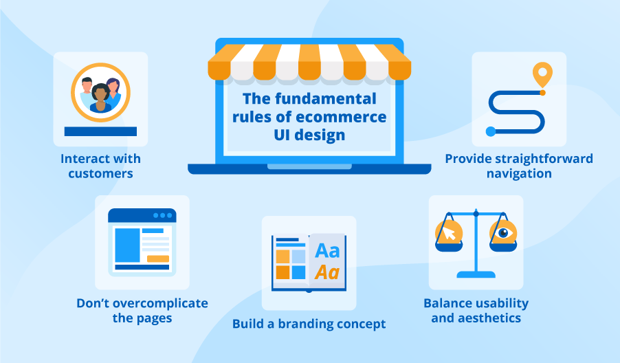
As an ecommerce customer checks out, it should be easy, short, and user-friendly. Any delay, complication, or confusion results in the loss of the sale usually. The checkout process must be as short and easy as possible to reduce shopping cart abandonment. The design should be clear, minimal, and important parts should stand out.
Companies and entrepreneurs that want to get the right website from the start can work with experts. Existing ecommerce website operators can work with professionals to make the necessary changes for improvements. Working through consulting services enables brands to gain temporary expert assistance without long-term commitments. There is no learning curve for consultants that work with clients on their ecommerce websites. Consultants can quickly point out what improvements can be made. New startups can work with consultants to make sure no costly mistakes are made.


